I am working on the cover for Further Arrangements! That means it's time for a poll!
I originally had three different layout ideas for this cover, each of them a triptych: vertical, horizontal, and triangular. The horizontal layout was the least popular on my Twitter poll, and would require totally different illustrations for each section. But I could do the triangular & vertical layouts using the same illos for two sections, though I had to redraw the third. So I did the vertical layout on Sunday, and then yesterday & Tuesday I pushed things about to make the triangular one. It was more annoying than I'd expected.
I don't like the separators for the triangular layout at all. and I miss having the twee cat-tail-heart-shape. Even though it is very very twee. I think the triangular layout is a better use of space, but I'm still not sure. Maybe I just need to re-do the cats? Maybe there's not enough whitespace in the triangular version? I DON'T KNOW I HAVE NO MEASURABLE GRAPHIC DESIGNS SKILLS HELP.
The title/author text is a placeholder because I don't have the typeface![[livejournal.com profile]](https://www.dreamwidth.org/img/external/lj-userinfo.gif) alinsa used on RA. Final one will match RA's.
alinsa used on RA. Final one will match RA's.
So. POLL!
Triangular layout:

Vertical layout:

[Poll #2033561]
You can click on the images to enlarge. They're displayed at approximately Amazon-preview-size, because that is the size they will be most often viewed at prior to purchase. This is the size I want them to look best at.
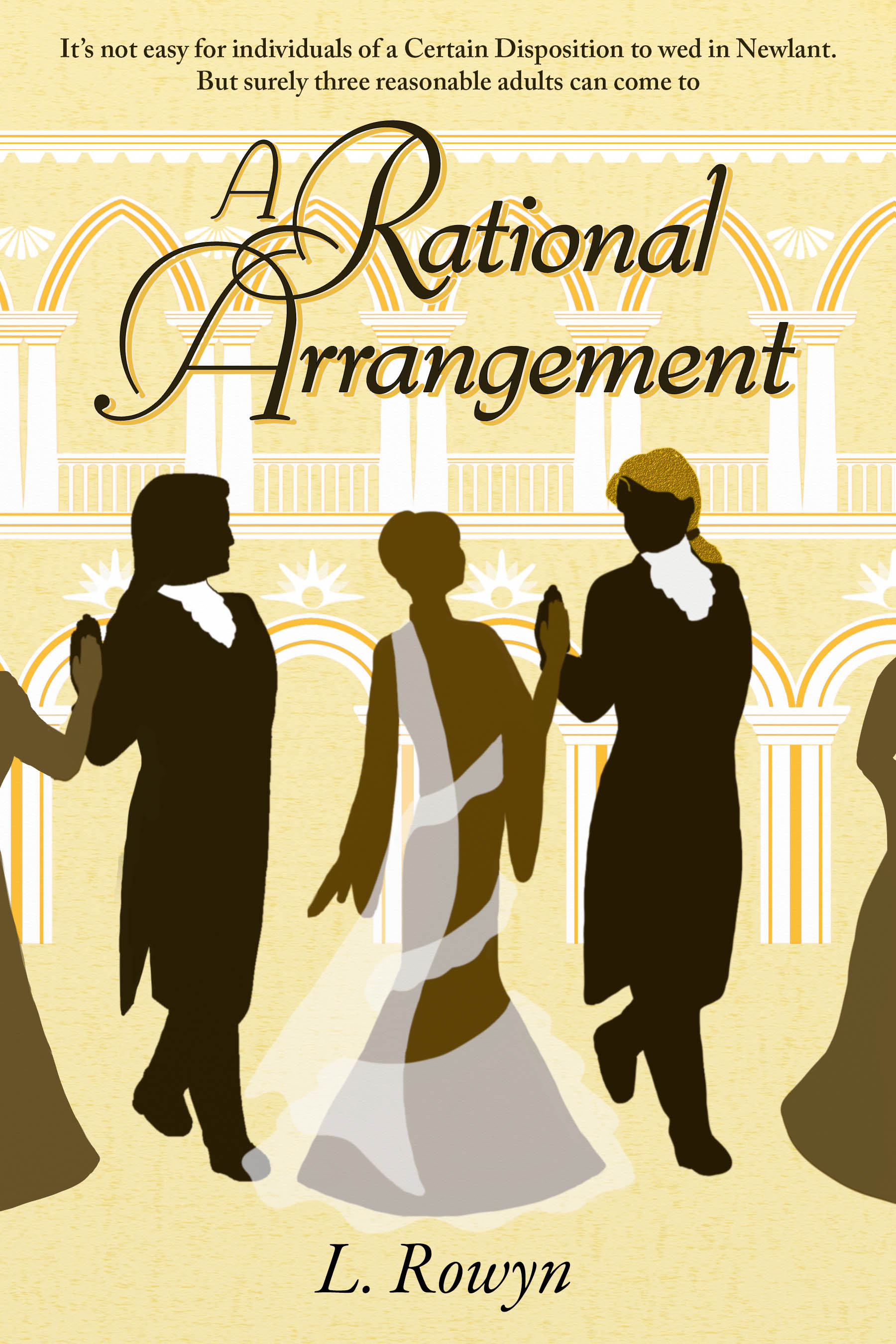
Edit: At Micah's suggestion: the two potential covers bracketing RA's cover:

I originally had three different layout ideas for this cover, each of them a triptych: vertical, horizontal, and triangular. The horizontal layout was the least popular on my Twitter poll, and would require totally different illustrations for each section. But I could do the triangular & vertical layouts using the same illos for two sections, though I had to redraw the third. So I did the vertical layout on Sunday, and then yesterday & Tuesday I pushed things about to make the triangular one. It was more annoying than I'd expected.
I don't like the separators for the triangular layout at all. and I miss having the twee cat-tail-heart-shape. Even though it is very very twee. I think the triangular layout is a better use of space, but I'm still not sure. Maybe I just need to re-do the cats? Maybe there's not enough whitespace in the triangular version? I DON'T KNOW I HAVE NO MEASURABLE GRAPHIC DESIGNS SKILLS HELP.
The title/author text is a placeholder because I don't have the typeface
So. POLL!
Triangular layout:
Vertical layout:
[Poll #2033561]
You can click on the images to enlarge. They're displayed at approximately Amazon-preview-size, because that is the size they will be most often viewed at prior to purchase. This is the size I want them to look best at.
Edit: At Micah's suggestion: the two potential covers bracketing RA's cover:
no subject
Date: 2016-01-14 04:26 pm (UTC)vertical! with slightly thinner columns! yay twee!
no subject
Date: 2016-01-14 04:32 pm (UTC)no subject
Date: 2016-01-14 04:55 pm (UTC)I need to put some frills into the whitespace, I think. Whichever version I use.
no subject
Date: 2016-01-14 05:59 pm (UTC)no subject
Date: 2016-01-14 06:17 pm (UTC)When I look at them side-by-side, I like the vertical one more because the white space around the cats feels more elegant and understated to me. The poll thus far is not very helpful towards a decision. @_@
no subject
Date: 2016-01-14 06:19 pm (UTC)I find I feel more strongly about being able to tell the difference between them more, though, separate from their prettiness. :)
Of course, you could always switch them out for each other if one of them doesn't perform well!
no subject
Date: 2016-01-14 06:32 pm (UTC)I will have to poke at it some more, probably. But not too much more, because I am kicking this chick out of the nest in a couple of weeks. ONE WAY OR ANOTHER.
no subject
Date: 2016-01-15 04:13 am (UTC)I like the triangular one, upon consideration, because it feels more "dynamic" -- I love the heart-tails, but the verticals are more static.
no subject
Date: 2016-01-15 01:23 am (UTC)no subject
Date: 2016-01-15 10:34 am (UTC)If you were going to tinker with the triangular layout's separators, maybe some sort of keystonesque decoration to make it look more like a column resting on an arch? (Totally just tossing things around here.)