rowyn: (artistic)

I created more color images in 2022 than perhaps at any other point in my life. This was mostly the product of CuratorPrompts combined with my decision to start doing full-color sketches. Prior to 2022, my process went:

  • Draw some sketches
  • If motivated, start to shade and/or color the sketch
  • Probably give up at the above step
  • In the event that I didn’t give up, I would spend hours over the course of days/weeks/months completing the image, depending on the complexity. Digital sketches have carefully-labeled layers.

The Demon’s Alliance cover followed this process. I sketched it first, then did grayscale shading using ArtRage’s ‘pastel’ tool. Next, I used ArtRage’s colorization option to add color to the layers, and did final touch-ups in color. I started the image in January and finished it in April.

Cover for the book Demon's Alliance
cover for Demon’s Alliance. January-April 2022.

In May of 2022, I started doing mastodon.art’s CuratorPrompts. At first, I only did 2 minute sketches. But from the outset, I sketched in full color. Almost always, I was trying to capture the sense of the composition of the photograph rather than render the proportions or details of the image accurately.

2-minute digital sketch of a suspension bridge at night
my favorite 2-minute sketch, May 2022.

The two-minute sketches were digital, on a single layer -- with so little time, it wasn’t worth adding layers.

After several days, I started spending more time on the prompts. I’d do one long study and the other three prompts would be 2-5 minutes as warm-up.

A brown hand holding a flower.
an 85-minute sketch. June 2022

The “long studies” were more like paintings than sketches, but still comparatively quick. One of the advantages to intending each picture to be (a) quick and (b) practice was that I didn’t have much investment in any one painting. When I got bored or frustrated or thought ‘eh, it’s not getting any better than this’, I’d declare it done, post it, and move on to a new painting the next day.

I seldom used pencil sketches with these pictures. I’d start off in color, and my initial brushstrokes were generally part of the final picture. I added layers freely and didn’t bother labeling them, because I didn’t plan on working on the picture for long. If I needed to edit a layer, I could usually tell which one via the preview. Often, adding a new layer worked just as well for finishing the picture as making sure all of [whatever] was on the same layer. I also started using the oil paint tool more, although my trees were generally rendered with the ‘leaf’ tool, and I used the fur and hair tools for some images.
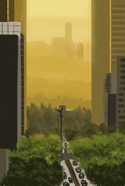
City at Dawn
66 minute sketch from June 23. I used the same photo reference later, when painting the cover for Angel’s Grace

Mastodon.art’s Curator posted some fabric and hand images for studies as well, and I did some of those in late June and July. These were not quick. I spent a few hours on each, trying to make them realistic, and they had pencil sketches before I did coloring.
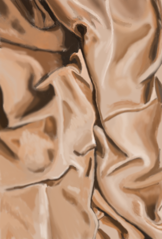
Digital painting of light brown wrinkled fabric
at small size, this looks pretty convincing. June 2022

Digital painting of hands holding flower
I tried to paint this photo three different times. On the last attempt, I resorted to a grid to get the perspective right. July 2022.

A twitter prompt in January to draw “The Mind Horse” reminded me how much I enjoy drawing horses. I did a number of horse and unicorn pictures during the year. This one, from July, is my favorite of the lot.

digital painting of a roan horse in a green field
based on a reference image from Pixabay.com. July 2022.

By mid-July, I was bored of just painting references. I started to add fantasy elements to my renditions of reference images.

A hummingbird wearing a harness, perched on a wire fence, with a warrior on its back
the fearsome Hummingbird Warrior. August 2022

In August, I stopped doing CuratorPrompts pictures every day, although I would continue to paint a few every month for the rest of the year. I continued to paint from references. The photo reference for the image below came from a search on Pexels.com for Niagara Falls, although amusingly it is not a photo of Niagara Falls. One of my two favorite paintings of the year.

Emergency responder dragons assist a spaceship descending over a massive river/series of waterfalls
emergency responder dragons are here to help. August 2022

The next painting was also from August 2022, and combined reference photos by Adorkastock with images from Pexels and Pixabay of the ocean and of butterfly wings. My other favorite of the year.

Butterfly-winged woman floating on her back in the sky above an ocean
Whispers Rain, from The Moon Etherium and The Twilight Etherium. August 2022.

In September, I spent 10+ hours working on an ambitious painting of the Crow Lord from my work-in-progress, A Dragonling’s Family.

The Crow Lord painting relied more on my old techniques. I started with a pencil-tool sketch, then used the ink and airbrush tools heavily for coloring it. I kept working and working on it, rather than spending a few hours total and calling it good enough.

A black-winged man on a darkened street, with crows flying around him
Crow Lord and frens. September 2022

One of my Fediverse friends, Veo Corva, commented that they enjoyed my CuratorPrompts + dragons pictures, so I did an Oops All Dragons edition for them in October:

Four digital paintings with different dragons in them
spent two and a half hours on the dragon-in-forest for this one, and an hour on each of the other three. October 2022

From October through December, I worked on the cover for Angel’s Grace.

City at dawn, with sky islands floating in the distance
Angel’s Grace wrap cover. Right half used a photograph of Mexico City from Pexels.com as inspiration. October-December 2022

I did a few other pictures in December, but my focus that month was on editing and publishing Angel’s Grace.

I made a retrospective-by-month image with a few of the same pictures as above, but mostly different ones, because “what I worked on during this specific month” didn’t correspond all that well with “what were my favorite pictures this year?”

12 small digital paintings of various subjects, arranged by month, by L. Rowyn


I am pleased by the amount of time I devoted to painting in 2022: 159 hours. Moreover, it’s the most time I’ve devoted in the last 30 years to practicing illustration -- studying references and trying new things and attempting to improve. I spent a lot of time in 2016 drawing, too, but those were “churn out specific illustration for A Rational Arrangement” rather than “get better at illustrating.”

I am not sure how much I really did improve. I used photo references for both the Demon’s Alliance and Angel’s Grace covers, and I like the latter illustration much better than the former. So that’s one data point suggesting Actual Improvement happened? But it’s hard for me to compare. Maybe at some point I will try re-doing one of my older pictures and see if I can make a fair comparison. The challenge there is that I don’t have many full-color pictures from when I was younger, and I can’t think of anything I still have that I like enough to try to do again.

rowyn: (artistic)

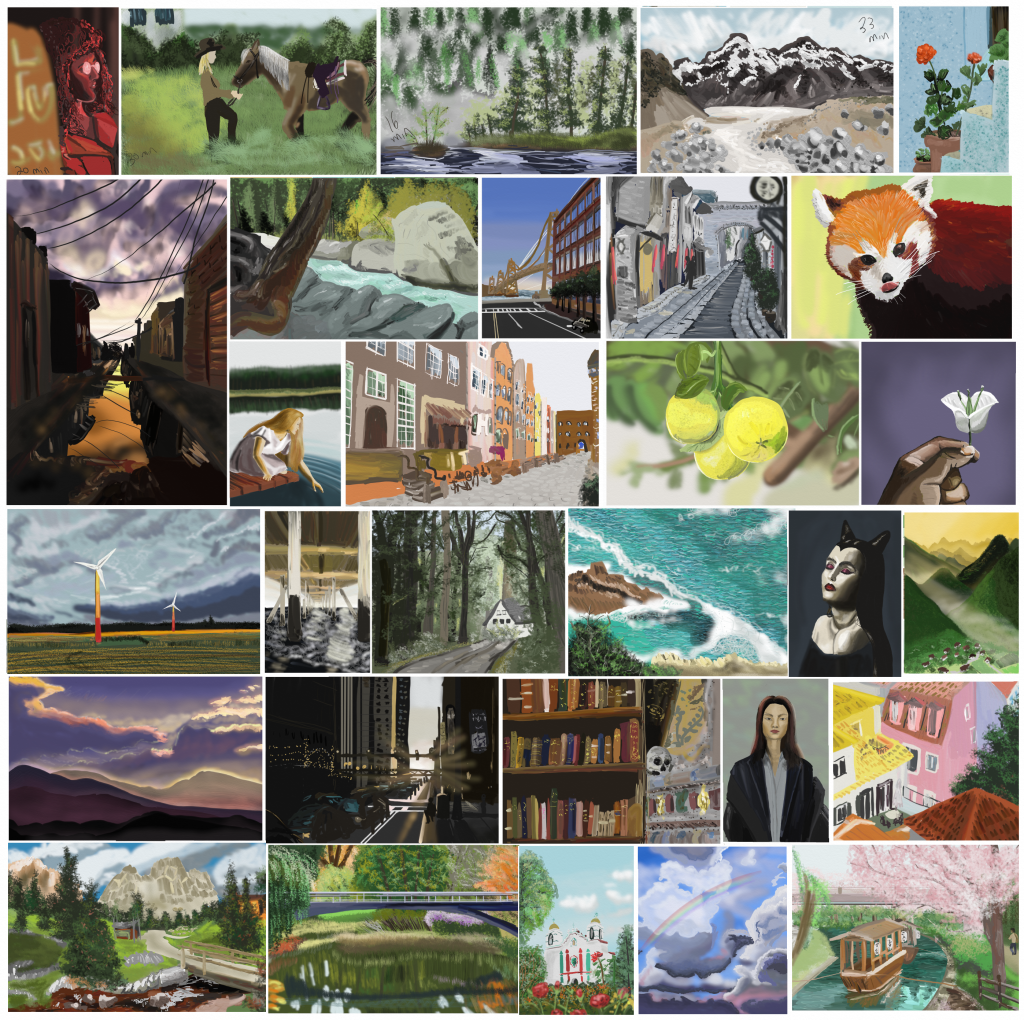
I'd planned to do a collage of all the long studies I'd done for #CuratorPrompts when I hit a month. (CuratorPrompts groups of four CC 0 images posted daily by the mastodon.art's Curator account: https://mastodon.art/@Curator. I mentioned in them in my monthly recap). Instead, I compiled it when I reached 30 studies -- that took 29 days because I did two sets of prompts on June 14th. But my layout turned out to fit the 30 pretty well, so I figured I'd just post it.

These are from CuratorPrompts44-71, plus 1 & 2.

A collage of thirty digital paintings.

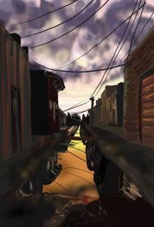
I broke down the paintings by my choice of subject matter, and then marked whether or not I liked my end result. For pics that fit multiple categories, I picked the one I spent the most time on. So the building in the bottom middle is Spite Architecture even though the landscape dominates the image.

“Spite Architecture” got its name because architecture was perhaps my least favorite thing to draw. So the first time I picked a street scene as my long study, it was to spite myself.

My subject matter was always picked from one of four photos from the day’s prompts, so the subject matter reflects the intersection of three things:

  • What Curator felt like posting today
  • Which photo I liked (sometimes)
  • What I figured I needed practice on (sometimes)

Category Total I liked Percent I liked
Landscapes 12 6 50%
People 4 1 25%
Animals 2 0 0%
Spite Architecture 8 3 38%
Close-ups 4 2 50%

Liking the photo reference for the picture is neither necessary nor sufficient. But in most cases, I only like my painting if I also like the photo. There were several photos that I like but I don't like my paintings -- pretty much all landscapes.

I have a strong preference for Dramatic Lighting. There were a few references that didn't have dramatic lighting but I liked them and/or my painting of them. But of my four Very Favorites, three had strong or interesting lighting effects.

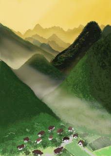
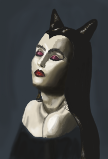
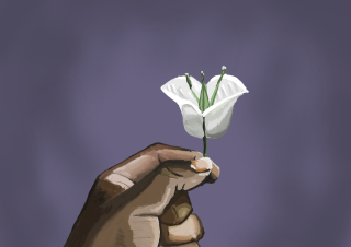
A dark town street at sunset, sky cloudy purple Green and gold mountains with early-morning-light making the sky yellow. Bust of a goth woman with dark red makeup A brown hand holding a flower.

I'm enjoying doing the Curator Prompts and plan to continue. I can't tell yet if I'm getting any better. The range of subjects is diverse and the amount of time I devote to the longer studies is variable. But perhaps in time I will notice a difference.

The thing where I don't like my pictures of animals or people has emerged as surprising and troubling. Those are the subjects I care about and the ones I've spent the most time drawing, over the course of my life. I'm pretty sure the reason I dislike my paintings of animals and people is because I care about those subjects most. That is, I don't think my ability to render Spite Architecture is objectively better. I think I care less when I mess up architecture, so the flaws don't bother me.

But like most humans, I am more inclined to do something when I enjoy the results of doing it in the short-term. So my inclination will be "paint landscapes and architecture that have dramatic lighting." If I want to get better at people, I'll need to make a conscious effort.

The question that keeps coming back to my mind is “what am I trying to accomplish?” AI art is growing increasingly competent and looks much less like “several pictures stolen via image search and badly photoshopped together.” Computers will learn how to create great art faster than I will, even if AI art may always feel like a copyright violation. I know artists who spend all their time on art, ten or more hours a day, often studying to improve -- and yet still lament the skills they lack.

I’m spending, like, an hour or an hour and a half a day on illustrating. I do not want to devote every waking hour to it. My body would not tolerate it even if I did: my fingers cramp around the stylus after an hour or so. My technique and my results may improve over time, but I will never be great. I know this.

The last several days, I haven’t done much writing, or editing. I like to think that illustrating takes a different kind of creativity, but does it really? Am I taking a break from writing because I am at difficult spots in my WIPs? Or is illustrating crowding out writing?

Even now, I’d rather be drawing than writing this post about drawing. (I spent an hour and a half drawing earlier today. It is time to write).

I don’t have answers for any of this. I am dissatisfied with all of my paintings this month, even my favorites. Yet I am also proud of them: proud enough that I wanted to make this collage, and this post. Maybe I’ll even make another collage in 30 days!

I don’t know what I’m trying to accomplish, other than “get better at this.” Why? I don’t know. Do I love doing it? That would be reason enough.

Maybe? You’d think that was an easy question to answer, but it isn’t.

rowyn: (artistic)

“How many other characters do you have?” Frost asked, as I worked on a picture.

“I don’t know. I can’t even remember how many books I’ve written on the average day,” I told him.

“No, seriously. What if we just count the point-of-view characters?”

“It doesn’t matter,” I told him, but it was too late.

“Nikola, Wisteria, Justin. Anthser, Southing. Mirohirokon, Ardent Sojourner. Jinokimijin, Kimikireki. Zenobia -- ” Frost ticked them off on his fingers, then ran out of fingers and summoned a floating ledger to count them on instead. “Kildare, Madden. Sunrise, Bright, Raven, Mercy.”

“Look, is there a point to this exercise?” I asked him, as he conjured up my webpage to look at the list of books.

“Myself, Thistle. Spark, Komyau. Cherish, Dyaneli, Eclipse. Raindrop, Jaguar, Worth. I daresay I’ve missed some of the minor PoV characters -- ah, wait, you’ve some unpublished books, too. Let’s see, Kalisha, Rachel, Griffin. Swan, Breeze.” He flicked his fingers to total the calculation. “So thirty-one. Including myself. How many of them have you drawn?”

“If I include the covers -- ”

“By all means.”

“And the little interior sketches for Scales and Coils --”

“Of course.”

I glanced over the list of publications. “Twenty-five,” I pronounced, with a note of triumph. “See, I draw most of my characters.”

“Splendid. And whom have you drawn more than three times?”

“Um. Thistle. Ardent and Miro. Uh. Kildare and Madden, I think. You.”

“In truth? You’ve drawn Thistle four or more times?”

“Yes! Twice in pictures with you, and then two portraits.”

“Ah, yes. I did particularly enjoy that second portrait,” Frost said.

“Thank you.” I returned my attention to my tablet.

“So. More than four, then?”

“... just you,” I admitted.

“More than ten?” he asked. “Still just me, is it?”

“That’s how numbers work, yes.”

“But there must be an upper bound. You’ve not drawn me a hundred times. Yet. Have you?”

“No! Like ... twelve,” I said. He gave me a skeptical look. “Maybe twenty if you count all the sketches and the non-canon drawings when I was trying to decide what you look like. Or twenty-five. Not more than thirty, I’m sure.”

“Are you, now.”

“Look, it’s not my fault you’re the prettiest of my characters.”

“Setting aside that you created me and my appearance is quite literally your fault, I am far from the prettiest of your characters. Moreover --” Frost gestured pointedly at my tablet “-- I am indisputably not the one with the most prominent bust.”

“Just because it’s a boob meme doesn’t mean you have to use a character with big boobs for it,” I protested. Frost eyed me. “It’s not! Most of my friends and acquaintances who did it used small-chested or male characters.”

Frost sighed. “I do not understand your fascination with drawing me. Could you not draw someone else? Do you not tire of drawing the same person over and over again?”

“I haven’t drawn you enough times to be bored yet. Don’t look at me like that! Comic artists draw the same characters thousands of times. I drew myself like ten times just doing that silly two-page tribute comic for The Three Jaguars.” I pulled it up and counted. “Eighteen times! In two pages! Twenty or thirty times is nothing. Also, Lut was in the hospital and I wanted to do something self-indulgent and fun.”

“You’ve succeeded at the self-indulgent part, I will grant.” He eyed my drawing with another sigh. “I suppose it serves as a good excuse.”

“Look, send someone by to cure Lut’s cancer and I promise, I’ll draw Thistle like a thousand times for you,” I offered.

“Hah. Fair enough.”

I really did spend too much time on this goofy meme, though.

shirt cut meme

rowyn: (artistic)

I apparently didn’t set enough goals plus stretch goals for January, because I’m running out of goals to complete and I’ve already done all but one.

One of the goals was “make an art”. I’ve been doing some work on art every week this month, but most of it is on the eternally incomplete cover for The Lord, His Monster, and Their Lady. Which I need to finish soon because Alinsa got the draft of the e-book to me, so we’re getting close to the point where “no cover” is the reason I can’t publish it yet. o_o;;

But I took a break to doodle a picture of the Anesh Archipelago from the Demon’s Series. Because I finished drafting book 4 this month so I’ll need covers for those books soon too. Oog. I miss commissioning book covers. Anyway, this is definitely not a book cover, it’s just me thinking about how the setting looks. During a storm-cloud-filled sunrise, in this case.

Storm brewing in Anesh

rowyn: (artistic)

I mentioned at the end of 2020 that I wanted to do one of those "art collage by month" things for the year, so I finally put that together.

2020 Art Collage

Much of the "by month" part is fudged, because a lot of this was stuff like "I started this in November 2019 and finished it in July 2020 but I'm going to put it down for February 2020 because that was the month I mostly finished it and also I didn't do anything else in February 2020."

I have art for May and June 2020, but I didn't want to use them because the May pictures were bad and the June one is the still-unfinished cover for The Lord, His Monster, and Their Lady. Also, it was harder to layout if I included those. The December picture is an icon I did many years ago (13?) for Lut. He wanted a mask added to it. ♥

February, March, and April are book covers for The Twilight Etherium, The Mortal Prince and the Moon Etherium, and Spark of Desire, respectively. September is a portrait of Raven from Demon's Lure and Angel's Sigil. August is doodle of one of my characters from when I was 12. The "re-draw your characters from when you were a kid" meme doesn't work well for me, in part because I am still not that good at art and in part because I don't have any of my drawings from when I was kid. (My oldest work is from college and because I seldom practice, my style has not changed or improved much.) July is a doodle of Cherish from The Princess, Her Dragon, and Their Prince, from when my fediverse friends were doing an alphabet-letter-a-day thing ("C is for Cherish", in this case.) I liked the way the crochet draped over her arm came out. January was "I should practice drawing more" and used a Pixabay photo for reference. October was inspired by an artist's landscape and I wanted to try something with a similar palette and a stylized look. November was "let's try that palette again but more of a landscape this time," and also used Pixabay for a reference.

I have done some drawing in January but it's all Yet More Work on The Lord, His Monster, and Their Lady cover. I should do a nice color doodle in the next week so I have something for a 2021 collage. >_>

rowyn: (Default)
Some weeks ago, I saw a "DrawYourOCInThis tweet of some lovely lingerie.

My immediate thought: "I should draw Frost in this!"
Frost: "Really. Me."
Thistle: "yes pls."
Frost: "Don't you have at least twelve female protagonists you could draw instead?"
Me: "C'mon, Frost. You wear robes and gowns with long skirts in 90% of the book and when you're not wearing those, you're cross-dressing by your own culture's standards." Frost: "I do not object to it being feminine. I object to it being lingerie."
Me: "Just because I don't describe you in lingerie in the book doesn't mean you'd never wear it."
Frost: "I would not wear it in public."
Me: "Who says you're in public?"
Frost: "You are posting it on Twitter."
Me: ".... my feed isn't that popular?"
Frost: *narrows his eyes at me*
Me: "You're disrobing on the book cover!"
Frost: "Everyone undresses. Not everyone wears over-the-top lingerie. It's different."
Me: "...if you didn't want to be objectified you shouldn't've been fictional."
Illustration is in an ordinary pose and shows less skin than a bathing suit, but still. It's lingerie. Might be NSFW depending on your workplace.  )


I am not sure why Frost is my go-to for objectification, though. I've drawn more pictures of him than any other character, outside of header images. By a huge margin. Most of my protagonists get maybe a thumbnail sketch, if that. Frost has his own folder. I dunno.

The thing I am happiest about with this picture is that I managed to draw a male character in a feminine outfit but he still looks like a man. I am bad at drawing men that look male so this is a triumph for me.

Frost is from Frost and Desire.
The pose reference is from SenshiStock.
The background reference is from a photo I took of a plaza in Venice. (Piazzo San Marco, IIRC.)

Gimme One

Dec. 14th, 2018 08:44 am
rowyn: (Default)
"Good work, large friend! Gimme one!"

gimme one

I pronounced this drawing done a few days ago. This is the first time I've done a black and white digital picture and then converted the b&w to color. (There is a specific tool that basically changed the color without changing the values. So you select the areas/layers that have the same color -- "these are all brown skin" -- and just change them, and it keeps all the shading.) I am not perfectly happy with the process. I think I am supposed to do some touch-up work to make it look better. This probably requires looking at tutorials or something. I find tutorials on digital art a bit grating because they're all designed around Photopaint and while I have two art programs and they can do most of the things Photopaint can, they do not do them in the same way so spending five minutes watching someone dig through submenus on Photopaint is not as helpful as I'd like.

For this particular picture, however, I'm calling it here. I didn't have a purpose in mind for it anyway. It's just "I saw this pose on a Senshistock (a stock/pose reference account) and went OMIGOSH SO CUTE I WANT TO DRAW THIS."

Now I've spent 15 hours drawing it and I feel like I should come up with personalities for the characters and write a story for them. I mean, I already have a cover, that's the hard part, right?

It kind of is, actually.

I don't think I like this picture enough to make it a book cover though. Even if there is plenty of room at the bottom to lay out the title and author name.

I am a little tempted to go back to one of my early pictures of Miro and Ardent and try coloring it in this fashion, though. Except the layout on my favorite wouldn't make a particularly good book cover. I feel like, while my rendering skills are weak, my framing skills are [File Not Found]. I can't figure out how to frame things in a dynamic, effective way. Art. So hard.
rowyn: (artistic)
I drew many pictures in 2015! Enough that I decided to do a picture-a-month collage, which I gather is a DeviantArt thing? I don't know if I did it right. Especially since I had to leave January blank because I drew absolutely nothing during it. I didn't start working on headers until April, and February was the first month that I started going to Panera and doing sketches from Twitter user prompts.


February: a sketch for @ChipUni's prompt of "werewolf cub on moonlit night".
March: A ladybug for [livejournal.com profile] ankewehner, from her Twitter prompt.
April: For [livejournal.com profile] alinsa's Twitter prompt: "Isolation".
May: I could have used headers for every month from April through November, but I wanted some variety. This one is of Anthser and Nikola during the bowrace. I'm using these from the month I completed them, not the month they were posted.
June: For [livejournal.com profile] iron_fox21's "opossum motorcycle gang" prompt on Twitter. The shoulder patch that is too small to read says "Brothers of the Pouch".
July: Wisteria, from the header where Nikola kisses her hand.
August: "Coffeemonsters" for Twitter user @MorganRLevine. The droopy one is the not-enough-coffee monster.
September: Wisteria and Nikola, from the scene of their first kiss.
October: One of the few illustrations that was neither a Twitter prompt nor an RA header! Frost giving a lesson to his apprentice, Thistle.
November: Wisteria and Justin when he called on her after the rescue.
December: From a Twitter prompt: [livejournal.com profile] iron_fox21's fursona.

Painting

Oct. 4th, 2015 10:40 pm
rowyn: (Me 2012)
I finished the first draft of "A Regular Hero" today. (It came out to 19 scenes, so [livejournal.com profile] tuftears wins the contest. :D )

So I spent the evening painting to celebrate. Or something like that. @_@

My thought process when painting is something like this:

This sketch is okay. It'll look better when it's colored.
... no, that made it much worse.
I have no idea what I'm doing. Why do I keep using the marker and airbrush tool for everything?
*zen-like state where I have no thoughts*
This part is a disaster.
*zen*
Now it's just bad.
*zen*
Let's just do a different part.
ZOMG painting with a reference is wonderful why do I not always use a reference?
*zen*
Why do I ever paint anything but naked torsos this is the best ever. Except maybe horses.
*zen*
actually this robe is kind of fun too.
*zen*
ohh this looks pretty good I might even like this picture when I'm done
*zen*
Why are hands so hard to draw?
Hands STAHP
no hands please just look like hands
just look a little like hands
please
I even have a reference why can't I do this?
and hands are so beautiful too whyyyyyyyy
*cries forever*
that's it I give up YOU ARE CRUEL, HANDS, CRUEL and I'm leaving you for hair.
*zen*
*more zen*
*wonders why my hand hurts*
*goes back to ignoring pain because zen*
That's about done ...
... oh wait that one part is still bad. NO NOT THE HANDS I HATE YOU HANDS and you're just going to stay bad. That other part.
*tries to fix*
How did I not notice until now that the proportions are completely messed up here?
*tries to fix the proportions at way too late a stage*
uh okay.
I should do a simple background thing.
*plays with every tool in artRage*
*zen*
Huh. Is that how it looks at the end? I thought it was gonna be better.
Oh well. Done now!
What how did it get be so late? @_@

I'll put the picture behind a cut-tag. It's a beefcake picture of Frost, because I decided if I'm mainly drawing him 'cause he's pretty I might as well go full objectification with it.
Cut for bare-chested male elf! )
rowyn: (Me 2012)
I have three finalists! You should be able to click to enlarge any of 'em. They're shown in the poll at the thumbnail size used on Amazon.

[Poll #2013914]

This poll is only about the typeface/text style used for the title & author. Please disregard the slight differences in the background (the final text is all going to be slapped on the same background.)

Thanks, everyone!
rowyn: (artistic)
But inching closer. These are my two contenders at present; I can't quite making up my mind whether I like the nested "A Rational" or not. I think it looks a little more elegant and is a little less readable. Hrmph.


[livejournal.com profile] alinsa wanted to take a stab at it, so I will see what she comes up with before I make my final decision. But I don't think I'll be making any more significant changes myself. Perhaps fiddling with the teaser text.

MOAR PONIES

Jan. 8th, 2012 03:24 pm
rowyn: (Default)

Fluttershy-shadowbolt, originally uploaded by Lady Rowyn.

Okay, this one is [livejournal.com profile] terrycloth's fault.

Fluttershy as a Shadowbolt. From Terrycloth's fanfic, "No Need for Rainbows". Where it actually makes sense that Fluttershy is a Shadowbolt. No, really. The story is adorable, in fact. :)


This is my first attempt to synthesize my own pony; I used a bunch of ponypics for reference, but it's not actually a copy of any given picture.
rowyn: (artistic)

The Mane Cast, originally uploaded by Lady Rowyn.


Maybe I should blame [livejournal.com profile] terrycloth, because he's the one who got me started watching the show, but no. I blame [livejournal.com profile] the_gneech for this one. I watched the Gneech Livestreaming the creation of his last ponypic, and watching someone else draw a pony made me realize what freakish little creatures these guys are. Their proportions are bizarre: their eyes take up about a third of the space on their faces, their foreheads are gigantic, they have these teeny button muzzles that are maybe half the size of one eye, and their bodies are only slighlty larger than their heads. No, really, if you take a typical image from the show, the distance from base of neck to top of head is almost as long as the distance from base of neck to bottom of foot. And yet, somehow, they're adorable anyway.

Since it's an animated kid's show, the characters are colored very simply as well as highly stylized, and it made me wonder how hard they are to draw. Finally, I decided to go ahead and try it.

Answer: DAMN HARD. I spent over two hours sketching them by staring at screenshot references and freehanding copies -- all of these sketches are copies of poses from the show. Copying an image, or working from life, is much easier for me than trying to draw from my head. But even with a reference right there, I struggled trying to make the copy look like the original. My sketch of Rainbow Dash looks like Twilight Sparkle to me and I don't even know why. @.@ Even knowing that the bodies are supposed to be tiny, I still drew them a little too large. It's just ... weird.

In theory, I don't think of fan art as the highest and best use of my creative energy. In practice, pretty much all the art I do is fan art, albeit usually for more obscure fandoms. So, I don't know, maybe I'll draw more ponies if the mood strikes me. I'm pretty sure that drawing ponies is what I did instead of playing more Star Wars: the Old Republic, not what I did instead of writing fiction, so what the heck. It's all good.

Tufty!

Oct. 2nd, 2011 09:18 am
rowyn: (current)

After approximately forever, I finally finished the art card for [livejournal.com profile] tuftears.  Crappy cell phone pic below because hooking up my scanner is ... problematic.

Posted via LiveJournal app for Android.

rowyn: (Default)

Five Black Griffons, originally uploaded by Lady Rowyn.

[livejournal.com profile] terrycloth switched viewpoint characters on his story, "Familiar". So I had to do a picture of the new POV character. (OK, I didn't have to. I wanted to, though.) This is Five Black Griffons. Yes, all of the figures are one character. Five Black Griffons is a gestalt: a single person made up by combining (in this case) five individuals. Gestalts can control multiple bodies; Five Black Griffons controls the bodies of the two space otters who joined them, plus a multitude of black bats and rats. I drew both otters and threw in two bats and one rat in the foreground to represent the five total components, but there are a lot more rats and bats that belong to the gestalt, which is why there are more of those in the background.


And an icon-sized version, if Terrycloth decides not to stick with the one he made for himself:

5BG-icon
rowyn: (artistic)
Earth Era

The dominant figure is supposed to be Era, the main protagonist from [livejournal.com profile] terrycloth's latest story, Familiar. She looks more-or-less like an otter with the coloration of a grey squirrel.

Instead of putting the picture under the cut tag, I am putting my artistic whinging under it instead. )

Art Anyway

Feb. 1st, 2010 07:40 am
rowyn: (artistic)
This weekend, having finished the art card project, I found that I kept thinking about doing art anyway. By midday Saturday, I gave up and decided to work on a new picture. During my multiple art supply runs, I'd come across something called "Aquabord™". It's "Claybord™ textured", and appears to be a piece of the kind of board used to make clipboards (chipboard, maybe?) coated in some kind of clay. [livejournal.com profile] ursulav had sung the praises of clayboard before, so I was curious about it. This stuff was supposed to be for watercolors, and one of the things that annoys me the most about watercolors is the way the medium warps the paper. Well, this stuff clearly wasn't going to warp for anything short of being thrown in a pool for a couple of days, so I picked up a package of three 5"x7" boards.

5"x7" is four times the size of the art cards I've been working with. Huge!

I spent an hour or two looking at pictures of otters and references in DragonArt. At one point in DragonArt, J. Peffer illustrates the principal of giving your figures realistic-looking anatomy, but not by directly basing them on real animals. In so doing, she draws this adorable cat-dragon -- kind of a dragon-skin on top of a cat body. It's so cute! I kinda wanted to do that with this figure, but didn't.

Zi-Ri-Orren-Hybrid-v2

The gigantic pale purple tree in the background is the trunk of the World Tree, so many miles away that distortion from the atmosphere turns it hazy and blue, the way distant mountains look on Earth. I tried to make it obvious that's what was going on by having a receding line of mountains in the nearer distance, but I'm not sure it works. I got the idea from an illustration [livejournal.com profile] haikujaguar did which had the World Tree trunk in the distance like this, and thought it was so cool I had to try it myself.

I scanned in the early sketches to, so those who like to see the process can click here to see them )
rowyn: (artistic)
Last batch from the art card challenge! First one out of order, because it's my favorite:

28-Bee

My second watercolor painting, and probably my favorite of the whole set, at least as far as technical skill goes. It's on textured paper, because I couldn't tell which was watercolor and which was textured in the variety pack. Later I bought more watercolor cards so now I know which is which.

I like this one a lot, too:

22-Green Dragon

I was browsing through [livejournal.com profile] haikujaguar's art archive from 2001 or so, and she had some pictures up where she'd been practicing drawing dragon wings. I thought "That looks like fun", so I started drawing a dragon wing, which went fine. Then tried to draw a dragon body, which did not go as well. Then I remembered that I have a 'How to Draw Dragons' book (DragonArt) that [livejournal.com profile] koogrr got me several years ago. Yay! I got it down and used it to draw this dragon, which I quite like. I did two more dragons after this one because I was enjoying using the book so much.

4 more behind the cut. All work-safe, cut for length. )
rowyn: (artistic)
Oh right, I was going to link to the mermaid card separately. Here she is!
Hidden behind the cut due to boobies! )

Djinn

Dec. 16th, 2009 04:44 pm
rowyn: (Default)
Art! Bikini-clad pinup type thing. )
This is a marker-piece I started ... a long time ago. Eighteen months? I worked on it sporadically for a really long time, and eventually pronounced it done in October. "Done" here meaning "It's never getting any better and I'm sick of working on it". I tried to give the original to [livejournal.com profile] terrycloth as a birthday present, but failed. I will probably try again. Bringing a frame next time, so that I won't store it in my sketchbook for safekeeping after showing it to him and then taking it home with me by accident. Well, unframed artwork just gets destroyed anyway.

September 2025

S M T W T F S
 12345 6
78910111213
14151617181920
21222324252627
282930    

Syndicate

RSS Atom

Most Popular Tags

Style Credit

Expand Cut Tags

No cut tags
Page generated Oct. 2nd, 2025 12:05 am
Powered by Dreamwidth Studios