One of the other things* I need before I can publish is a cover. I started work on this a couple of months ago, found it depressing and overwhelming, and gave up for a while. Friday I decided to take another stab at it. Today I figured I would post about it and see what people think.
My first concept was simple -- black background, white text, three riings to symbolize "polyamorous romance". I was appalled by the first attempt and decided to try a different color scheme. I'm putting this one up mainly because Lut liked the black & white color scheme better than the one I preferred. The "three rings" are from a public domain photo.

The brown-and-gold one below is the first one I considered adequate. The ring image is a modified version of this photo by Jeff Belmonte, which is licensed on CC 2.0.

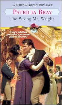
After doing the one above, I spend some time thinking about what image I'd want if I used an illustration instead of a symbol. I looked at other romance covers for inspiration. This cover, for The Wrong Mr. Wright, made me think of showing the three protagonists dancing, which is even something that happens in the book. And then I gave up for a while, because my art skillz are not remotely qualified to do a realistic painting.
But since I've been doing all the header illustrations, I figured I could try doing the same style for a cover illustration. I spent Friday and today working at it. It doesn't look like it would take that long, does it?

Also, somehow the ratio on it is different from the others. I am not sure what happened there.
The typeface is Amazone BT (squished and re-kerned here and there). I made a list of 27 different fonts that I already owned and liked for the cover, and then every time I went to actually do the lettering, I used Amazone BT instead of trying one of the others. I dunno what's up with that.
None of these are exactly done; for instance, on the last one I don't like the way the title text interacts with the background arches (I spent a lot of time on those arches! Grrrr backgrounds. Now I have to spend more time on them, or possibly just rip them out. You will see more of these in a future header, and Now You Know Why. Because I am not going to have wasted all that time drawing them.)
Here's a poll if you want to pick your favorite(s):
[Poll #2012551]
Suggestions welcome! (Though I may not take them, due to time/money/psych lim contraints.)
* There are so many things, you guys. So. Many. THINGS.
My first concept was simple -- black background, white text, three riings to symbolize "polyamorous romance". I was appalled by the first attempt and decided to try a different color scheme. I'm putting this one up mainly because Lut liked the black & white color scheme better than the one I preferred. The "three rings" are from a public domain photo.

The brown-and-gold one below is the first one I considered adequate. The ring image is a modified version of this photo by Jeff Belmonte, which is licensed on CC 2.0.

After doing the one above, I spend some time thinking about what image I'd want if I used an illustration instead of a symbol. I looked at other romance covers for inspiration. This cover, for The Wrong Mr. Wright, made me think of showing the three protagonists dancing, which is even something that happens in the book. And then I gave up for a while, because my art skillz are not remotely qualified to do a realistic painting.
But since I've been doing all the header illustrations, I figured I could try doing the same style for a cover illustration. I spent Friday and today working at it. It doesn't look like it would take that long, does it?

Also, somehow the ratio on it is different from the others. I am not sure what happened there.
The typeface is Amazone BT (squished and re-kerned here and there). I made a list of 27 different fonts that I already owned and liked for the cover, and then every time I went to actually do the lettering, I used Amazone BT instead of trying one of the others. I dunno what's up with that.
None of these are exactly done; for instance, on the last one I don't like the way the title text interacts with the background arches (I spent a lot of time on those arches! Grrrr backgrounds. Now I have to spend more time on them, or possibly just rip them out. You will see more of these in a future header, and Now You Know Why. Because I am not going to have wasted all that time drawing them.)
Here's a poll if you want to pick your favorite(s):
[Poll #2012551]
Suggestions welcome! (Though I may not take them, due to time/money/psych lim contraints.)
* There are so many things, you guys. So. Many. THINGS.
...I wrote so long, I have to make 2 posts. Augh.
Date: 2015-05-30 09:17 pm (UTC)A: Definitely use the cover with the dancers. O:> The limited-color palette has a good chance to look striking at thumbnail size, where a busier cover would look muddy.
B: Make it wider! The proportions are off, and the people are squished into a narrow little viewing rectangle -- is this just a weird ratio thing when saving? If not... eeee! (It's not hurting the figures, but the narrow ratio isn't working. Either way, doublecheck https://www.smashwords.com/about/supportfaq#covers -- yes, even if you are not going to publish through Smashwords -- for length/width recommendations. Click-through to the blog post (http://blog.smashwords.com/2012/06/new-ebook-cover-image-requirements.html) regarding Apple's minimum cover sizes, and it also includes Amazon's preferred sizes. (This is why it's a good resource even if you're going through D2D or Amazon-exclusive.)
Depending on if this is just how the file saved, or if it really is that squished, you may -- sadly! -- need to make an archway to look at the people through, and put another gold border around the outside of that.
I'm not sure the light outer border is working for the image; it looks a little like if a picture was framed and there was still canvas showing outside the matting and frame. Experiment with using the shape of the dark part of the border, but making it the background (or perhaps just a little darker), and use the darkest of your colors for the outer rectangle. Or experiment with making the outermost rectangle much, much thinner, basically just an outline on the dark.
C: Your title is unbalanced -- I can get away with the side-stepping title on All That Glitters because the art is filling in the space. You have a lot of blank space up above "Rational" and it's throwing the thing off-balanced. Putting your name over to the right isn't helping, unfortunately. (Because the tall letters are intersecting her dress, I'd want them to be over on the left side!)
My first quick-and-dirty suggestion would be to pull down the image to the bottom, drag the title down a bit as well, and shove your name up above "Rational." Remember to leave enough space around the words that they won't look squished.
D: However, as you mention, the title is also overlapping a lot of the background, and unless you can really pump it up, the busy-ness of the font, on top of the busy-ness of the background... Noooooo! *slow-motion throwing self on the font*
If you have a Mac, pick up Art Text 2. (You can try it out free with Art Text 2 Lite.) Save often -- when I first got it, it was crashy, though the last time I futzed with it, it was fine. That will give you the ability to make "embossed" looking titles, with glow or shadow options to help make stuff stand out from the background. (I'm not going to say the Herb-Witch cover is a beautiful example -- it's extremely flawed in many ways -- but it does show what Art Text 2 can do with the edging on the letters to make it reasonably distinct from the background. ...I should go futz with that more sometime. O:p )
Again, pulling down the art and leaving the title close to the top -- with your name filling the empty space -- might be the best quick-and-dirty approach in that regard.
...I wrote so long, I have to make 2 posts. Part 2.
Date: 2015-05-30 09:17 pm (UTC)E: The "A"s on the title have opposite weights to what you should do, I think -- you have the first one large, but the one that's part of "Arrangement" is small. This is crippling your ability to make "Arrangement" the focus of the title. Reverse that -- make the first "A" smaller, so it won't get in the way of when you make Arrangement big and un-squished. Go back to "All That Glitters" and notice that "Glitters" is bigger than the other two words -- I think you might want to try cradling "A Rational" in the shape of the "Arrangement," if you see what I mean. Let Arrangement take up the current width, round and unsquished, and tuck a smaller capital A beside the first one, and stagger down Rational just a tad. Heck, make "Arrangement"'s A go big, up near-parallel the top of the R!
Another thing you might consider trying is to see if you can get away with a single A for both. It'd be a little tricky to make work, though, and don't spend a lot of time on it.
F: Don't squish your name. In fact, just as a general thing... Don't SQUISH any of the words. You can make the whole word a larger or smaller font-size, but don't compress any of them to fit. It creates a visual impression that either you're using different fonts in a kind of random way, or -- sorry, harsh alert! O:( -- the impression of a schoolkid who is trying to squish One. Last. Word. onto the margins of the paper. With the readability that you might expect.
(I may have been that kid more than once. >_> )
But that's not a good impression. You have a good font, so let it shine! Let Arrangement go from side to side. (And let your name relax, too, and not look so pinched.)
You may want to let the now-made-smaller A (the first one!) overlap Arrangement's A somewhat. It's a squirly font; it can support a little of that.
Anyway. I like the dancers. I want it to do well. The title layout and name layout are working against you like saboteurs in the night, right now.
Other resources:
http://kriswrites.com/2014/01/08/the-business-rusch-branding-discoverability-part-6-2/ (If nothing else, notice how small the words like "of," "the," and "on" are, on the covers where they aren't same-size to balance out a larger title above; shrink your first "A"!)
http://www.thebookdesigner.com/2011/08/monthly-e-book-cover-design-awards/ -- I don't always agree with the guy's assessments, but 1: it's a good way to really think about what works for you, and 2: if you wind up submitting your cover to one of the monthly contests, it's a way to get your cover in front of other people, so advertising. O;>
RE: ...I wrote so long, I have to make 2 posts. Augh.
Date: 2015-05-30 09:52 pm (UTC)I really like the dancers as a book cover motif though.
no subject
Date: 2015-05-30 09:19 pm (UTC)The only suggestion I have is to check how it reads at thumbnail size. The illustration proper shouldn't have any problems in small size, the title and your name might need to be adjusted to be clearer.
no subject
Date: 2015-05-30 11:04 pm (UTC)I realize you were working from available pictures, and there's probably not anything available that's similar to that arrangement, but I bet it wouldn't be too difficult to create a shot to look like that (or something similar). If nothing else I have all the gear to do pretty decent shots.
The third... I'm not sure how to make it not say "love triangle". It's very very pretty, otherwise, though, so that might be okay. I don't really read romance... do people get upset if they expect a love triangle and get a everyone-lives-happier-ever-after?
*
We should talk about typefaces; the one we liked for the title page is a different one (English 157, IIRC). We may or may not want the cover and title to match. Worth a moment of thought, at least. Some of the proportions of the title page one miiiiight make it easier to deal with some of the font spacing/placement issues that
You may also consider doing the author credit in a nonscripty typeface. I don't know that it will look any better or worse, but to me having them both scripty looked strange. I do not read this genre, so take with large grain of salt.
*
The third is definitely the wrong proportions, but that seems easily fixable.
*
If you go with the second (or something similar) I might suggest using a somewhat lighter color for the leather, like this:
*
I have an idea for kind of combining the second and third ... I'll have to sketch it out though, brain not working well enough to describe in words.
no subject
Date: 2015-05-31 01:19 am (UTC)As far as conveying "poly romance" goes, I suspect that the book blurb will have to convey it since "love triangle romance" is common enough that pretty much anything has the potential to be misinterpreted.
no subject
Date: 2015-05-30 11:15 pm (UTC)no subject
Date: 2015-05-31 01:31 am (UTC)(...help, I see The Mouse now. Help. *facepalm*)
no subject
Date: 2015-06-02 02:13 pm (UTC)a) I don't really want to write that much of the contract (or use placeholder text)
b) I like my versions all right. c_c